Last week we wrote about the five most popular pages on the websites of advisers and planners. Our research showed, unsurprisingly, that your website’s homepage is likely to be the most frequently visited page of any on the site; in fact, we’ve only seen two examples of where that isn’t the case.
Understanding engagement levels on your website’s homepage is the vital first step to improving its effectiveness. Of the three measures we use to assess client engagement:
- Time on your site
- Pages per visit
- Bounce rate
It’s the last one which is probably the most relevant to your website’s homepage.
Our research shows that the average bounce rate for an adviser or planner’s homepage is 45.15%.
How does yours compare?
If it’s higher than average, or even if you would just like to reduce the bounce rate and increase the chances of visitors making it past your homepage, we thought it was time to dust off one of our most popular checklists.
When we first published our “27 things your website should have on its homepage” checklist we came in for some criticism. We had comments such as: “27, that’s far too many” or “less is more”. We stand by the checklist though, in fact, we know it works.
So, here’s the first three things of the 27:
1. A clear, and intuitive navigation
Our attention span is getting shorter; according to Microsoft, it’s down to eight seconds. That means you need to make it as easy as possible for your website visitor to find what they need, and fast!
Only include the most important pages in your navigation and avoid unusual, faddy, navigation styles which your target audience may not understand.
Yes, Mr Burger Menu, we are looking at you!
2. Space
A cluttered, busy, website will put your visitor off. A sense of space, coupled with foolproof navigation and relevant images, will put them at ease as well as help them find what they are looking for.
3. An explanation of what you do, and who you do it for
Quickly make it obvious the types of clients you work with. That’ll make it easier for your visitor to find the information they need.
We call that the split-second test and it’s one you need to pass if you’re going to convince visitors to stay and look around.
That’s the first three, you can get the other 24 by downloading our checklist.
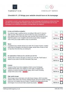
It’s free and there’s no pesky form to fill in with your contact details, simply click here or on the image to the right.
Next week, we’ll be looking at what’s probably the second most popular page on your website; the all-important contact page.
Until then, here’s your homework…
The Yardstick DIY
- Download and print the checklist by clicking here
- Check your homepage’s bounce rate using Google Analytics
- Make yourself a cuppa
- Work your way through the checklist
- Fix any items you can’t tick off yourself or outsource the job if you don’t have the time, inclination or knowledge


