When thinking about a website, there are lots of factors to consider. So, in time honoured fashion, here’s a complete A-Z of the things you should think about when building or maintaining a great quality site.
A – Accessibility
You have a ramp into your company’s building, right? Maybe even a lift to the first floor, if you have one? These are all architectural forms of accessibility to allow people with physical disabilities the same access to your services as someone without a disability.
But what about your website? If you have videos on your site, do you offer subtitles/a transcription? Do you have text-only versions of your infographics?
Whenever adding something to your website you need to consider whether you need to offer a text-only version of it, so that screen readers can read the content to someone who is blind. You also need to think about subtitles so someone who is deaf can read what is being spoken in a video/audio clip.
B – Branding
Developers love acronyms, and one of the first I was taught was KISS: “Keep it simple, stupid”.
This is probably the most important thing when it comes to the branding of your website. If your logo could replace Joseph’s Technicolour Dreamcoat, don’t feel like you need to put a bit of every colour from your logo on to every page of your website.
If you do have a lot of colours, or a complex brand, consider what aspects are the most important and focus on those. If every colour of the rainbow symbolises a different type of client you deal with, only use the individual colours on pages or sections relevant to that client type.
C – Colours
I remember back in the early 2000s when websites were still, mostly, terrible. You’d have red text on a black background, and yellow boxes with green text in them.
We’ve come a long way since then, but colours are still just as important to consider today. Even more so, I’d say, as having banner images and video banners makes choosing colours even more crucial. You don’t want your white text to get lost on a clear blue sky, for example.
It’s not just where text overlays images or videos that you need to be considerate of colour. If a colourblind person is looking at your website, will they be able to read the red “error” text in the yellow pop-up box?
D – Device compatibility
People access the internet on a variety of different devices. Whether it’s a standard laptop or the screen on their smart fridge, your website should be responsive.
This means that it will:
- Shrink or grow to fit the screen size it’s on
- Stack columns if they get too small
- Add or remove content which is non-essential, such as background images, as and when the screen size allows for it.
E – Ease of use
Nobody wants to play “Guess how to use the website” when landing on your pages.
If you have a slider on your site it should come with arrows or dots to navigate the slides. You should link to different pages in a menu that is at the top of your page or hidden away in a burger menu. When a user scrolls down, the page should scroll down.
All of these may sound obvious, but sometimes it is the most obvious things that someone will try to re-invent. Then, the user will become easily frustrated and leave.
When adding a section to your website, consider if you have seen something similar on a different website and follow what they have done. If what you are adding is unique, or you have only seen on one or two other websites, consider adding a bit of informational text to help guide the user in how they should interact with what you have added.
F – Fonts
Your brand has a font tied to it, that’s great. But is your font website-ready? Sure you can use the font on your website. But should you?
The font your website uses can make your text hard to read for people with poor eyesight, or dyslexia. So, you should always try to use a clear font with as few extra squiggles or similar, in a readable size, to ensure that everyone can find the information they need.
G – Grammar
Your website can look amazing, but if your content isn’t engaging then people are going to leave your site.
One way you can guarantee people will leave in a jiffy is by having poor grammar. There are some grammatical errors people may overlook, such as a “would of” instead of “would have” but if you are making bigger grammatical faux pas then they may not be able to forgive that and leave the site as a result.
There are many tools available for instant grammar checks, and these should be part of the process if you are writing content for your website. So that you don’t potentially drive away a user just because you put “Me and Jane was in the office…” instead of “Jane and I were in the office…”.
H – Headings
Headings, or titles, are there to tell users what the larger block(s) of text below are about.
“What we do”, “Planning for retirement”, or “Get in touch” are all great headings as they are short and let the user scan the page for the heading they are looking for.
Try to keep your headings short and make them stand out. Don’t have a whole sentence in your heading font/size, and don’t have a heading in your normal text’s font/size.
I – Icons
What do they mean? Why are you using them? Do they add anything? These are all very valid questions to ask yourself when thinking about adding icons to your website.
A universal icon, such an envelope next to your email address will give users the confidence that the button they are about to press is to send you an email.
But what about a button with a paper aeroplane icon? To you and me, we know that you are trying to signify sending something off, but what about to your aunt Mavis?
Asking someone who doesn’t know much about your business to review your website can give you a lot of much-needed input on where issues may be.
I remember I once asked my fiancée to translate parts of a website I was working on. They gave more useful feedback about where buttons were placed and labels for links and, in particular, which icons were being used inside them, than I could have imagined.
J – Justified text
Text justification, or text alignment, is where on the screen the text will originate; from the left, right, or centre.
In the English-speaking world, as with most languages, we write from left to right. This means that left-aligned text is what comes naturally to us, as it is how we learned to read in school.
Whenever you have large amounts of text this needs to be considered, as centre and right aligned text is harder to read, as it is not what we are used to. This difficulty isn’t too hard for most people to deal with, but for those with dyslexia, it is much harder.
K – Knowledge
You know your industry better than your clients, so show off this knowledge on your website. When a user lands on your website, they will be looking for information that will not only tell them that you can offer your services relevant to them, but also that you are an expert in what you do.
Don’t be afraid to brag a bit. Those awards your company has been winning year-on-year are a huge confidence booster to a potential client.
And to quote Albert Einstein: “If you can’t explain it simply, you don’t understand it well enough”. Users on your site may not understand what cashflow planning is, and its importance, so if you’re able to explain it without jargon, they will feel like you speak their language.
L – Logo
Dan has covered what makes a good logo in the past, so I will try not to step too much on his toes here.
Your logo shouldn’t stand out from your website. Usually placed at the top of the page, either in the left corner or the centre, it will be one of the first things a user sees. However, it doesn’t want to be something that grabs their attention; it should blend in nicely with the design of your website, and the fonts on the website and your logo should match, or at least complement each other.
M – Memes
Memes are funny, and memes get engagement when they’re funny. But if you don’t understand them, or how they are meant to be used, they should be avoided at all costs.
A long time ago, I came across a website’s 404 (page not found) page and this was what I was greeted to.
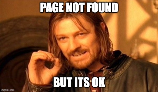
Aside from the fact they had put a huge meme on their 404 page, and this was a professional company, they obviously had no idea how it was meant to be used; which meant any comedic value it had was instantly lost… it also didn’t help that the meme had pretty much died at the time I found it.
N – Naming
The page titles and URL slugs of your website give information to users and search engines alike about what sort of content to expect on the page.
Page titles are what the user will see when going on to your website. They are usually at the top of the page in a much larger font size, and kept as short as possible; something like “About us”.
URL slugs are the extension after your domain name which tell your browser which page of your website to load, for example financial.com/about-us.
You may not think either of these matter too much as the rest of the page explains what you are saying. However, when someone is searching for something on Google, both of these play into the search results. On top of this, if a user goes to your “Business owners” page, and there is no page title to tell them they are on the right page, they may assume they clicked the wrong link.
O – Online
Having your website on the internet is all well and good, but is your business online? That is to say, are you on social media, can potential clients send email enquiries, do you have an online portal where your clients can access the latest information about what you are doing for them?
We live in a digital age, and more and more people expect to be able to access all of their communication or information via the internet. For some people, that is asking about a service via Facebook and for others it’s being able to log in to a website to keep on top of their finances.
If users cannot contact you, or receive updates about your business, via social media or email in 2021, then you need to start looking at this ASAP.
P – Popups
Has your user been on the site before? Have they had a look through a few pages already? Do you have reason to believe they are interested in what you have to offer, other than your own preconception that they should like what you do?
If you answered no to all of the above, don’t show them a popup which asks them to sign up for your newsletter. A newsletter popup will distract the user from the thing they are there for; finding out if you are the form for them. At worst, it could potentially cause them to leave.
By all means ask them to sign up for your newsletter, but make sure your website has some logic behind the popup so that it doesn’t just show it to everyone, all the time; whether it’s every page or first page visited.
Q – Quirky
We’re all human, and we all have our own quirks. Embrace them and show your human side on your website.
If you’re an avid paraglider, maybe include lots of images of the sky and paragliders across your site, and maybe even throw in the occasional term you’d use along with a brief explanation. For example, instead of having a heading “Get started with us” you may say “Glass-off with us”.
R – Repetition
Don’t be afraid to repeat sections across your site, or even the same page.
You can’t control which page a user will land on first, so don’t feel as if you cannot reuse the same brief explainer section on your homepage and about us page. The user may never see the about us page, but at least they will have that brief explanation about the company.
Sometimes a user will know what they want before reaching the bottom of the page, so don’t feel bad about having multiple prompts scattered across the page asking the user to contact you.
S – Speed
How big is that video banner you have just added to the site? Do you really need that massive image of the meeting room in your office covering the screen?
Large files will slow down your website. Images and videos are the most common two types of large files we see on our clients’ websites, however you may host your own podcast and upload the audio files to your site.
The larger the file, the longer it will take for the page to load. The longer it takes for your page to load, the more likely someone is to hit the back button and find another website to look at instead of yours.
T – Tone
When speaking to a person, we know exactly what tone we should keep our voice in. If we’re trying to comfort someone who is upset, we soften our voices and talk more casually. But if you’re speaking to a person in a position of power, you straighten your back and talk more professionally.
These same considerations in tone have to be put into the content on your website. But there’s also the added challenge of getting the right tone in text. It is easy to sound casual in speech, as slang and inflections are all very easy to say aloud. However, writing these is much harder… that is, if you want part of your site to sound casual.
U – Unique
Your business is unique. Sure, you may cater to the exact same types of people as the financial planner down the road, or the next town over, but you probably don’t deal with them the same way. Make sure the visitors to your website know this.
Sometimes the most minor differences could be huge to a client. For example, if you will go to a client’s house to conduct meetings and Joe Bloggs down the road only conducts meetings in the office, that could be a big thing to a potential client, so make sure you advertise this on your website.
V – Vibe
The definition of vibe amongst the youth is summed up as: the energy or attitude someone, or something, radiates. But can also mean to chill or relax.
What does this have to do with your website? Well, what vibes does it give off? If your website is giving off very corporate vibes, but you want to work mostly with younger people… good luck. Your websites vibe should match the groups of people you’re targeting, while also giving off the vibes they should expect.
It can be a hard line to tread, as one wouldn’t trust a company that communicated entirely in memes, but at the same time, they may not want to engage with a company that only posts on social media about financial updates and has a very stuffy or corporate approach.
W – Weight
Font weight is another way to refer to bolder or lighter versions of the font. When scanning a piece of text, it’s the words that are larger, bolder, or italicised which grab a reader’s attention.
If you want a user to focus on, or remember, a particular part of a long block of text, then using subtle nudges, such as increased font weight, is a great way to do this. However, if the word(s) you are making bold don’t add any value to the reader, then you need to question whether it is worth making them bold.
X – Xs
Xs or crosses are usually used to denote a cancel action. Whether that’s a close button with an X in it, or tick and cross to confirm or deny your choice.
These are handy little nudges for a user to know what the button does. However, size does matter. For example, if you make the close button to your newsletter popup so small it can barely be seen, or a colour that blends in with the background, then instead of filling in the form users may leave the site as they don’t want to fill in the form and can’t see a way to close it.
Y – Youthful
Even if your business is well-established and has been around for 30+ years, your website shouldn’t look like it has been. While the branding of your website will dictate just how youthful a website will look, and the sort of person it appeals to, you should aim to keep your website looking as modern as it can be while in keeping with your brand.
Z – Zeal
If you love what you do, and have the drive to improve another person’s life through your business, why aren’t you showing it off?
While the tone is hard to control in text, enthusiasm is seldom lost on a user. If the user believes that you have their best interests at heart, or thinks what you have to say is genuine, they are more likely to engage further with you; whether that’s signing up to your newsletter, or contacting you for more information.
Get in touch
As website experts, we know exactly how to create a website that appeals to your target audience and shows off your firm in the very best light.
To find out more, email hi@theyardstickagency.co.uk or call 0115 8965 300.