Mistakes can be a great thing.
Like when you find 21 McNuggets in the box or the parking attendant forgets to charge the batteries in their little machine.
But sometimes mistakes can be a not-so-great thing. Like ten years ago when you’re eating a Chinese takeaway in the bath and get woken up by your housemate giving you CPR.
While you’re being dragged back to the physical plane by a completely unqualified art student, in a whirlwind of special fried rice and Szechuan pork, you think only one thing:
“Woah this is bad… but not half as bad as finding out my new logo has been plagiarised.”
…!
Yes, that’s right; they’ve let me write another blog post, so buckle in and let’s look at five ways we make sure your logo is ready to be released into the wild.
1. Reverse image search
First up, let’s make sure that your logo isn’t in use anywhere else. Now, this is impossible to do 100% effectively. We’re all using the same combination of simple shapes and colours, and it’s 2021. What we can do, however, is give ourselves the best fighting chance of checking any obvious overlaps or accidental infringements.
We start with Google. Chances are, if your business exists online, it will appear in a Google image search. Of course, not everybody has a web presence (this study shows that in 2019, only 83.4% of businesses had a website – leaving roughly 700,000 logos in the wild with no way of checking them).
We don’t know what we don’t know, but we can upload our logo to Google image search to see if any obvious ones appear.
To do that, go to Google images and give this button a click:
You can then upload an image of your logo to see if any similar images exist. I uploaded the Yardstick logo, and got these results back:
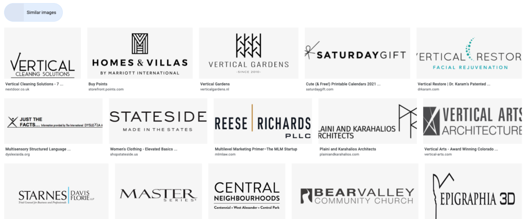
As you can see, there are a few similar fonts in there and one or two kind-of-familiar shapes, but it looks like we’re okay. Phew. It’s best to do this step with a black and white version of your logo too, as that generally focuses on shape, whereas the colour version can sometimes only focus on the palette.
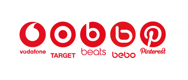
There are a few schools of thought as to what is too similar. Some would look at the below and argue that they are different enough, that they exist in different sectors and they aren’t using anything to deceive people into forming an association. Others might get a little nervous, so common sense is best applied here generously.
Stella Artois is widely agreed to be the oldest logo still in use today and was created 655 years ago. The name was added in 1926, but the crest was there from day one. Since then, millions of companies have arrived with their own logo designs. So, while little, if anything, is truly original; as long as you’ve done your due diligence, you’ll stay out of trouble.
2. Use mock-ups
Using renderings of real-world environments is another way we explore whether a logo works or not.
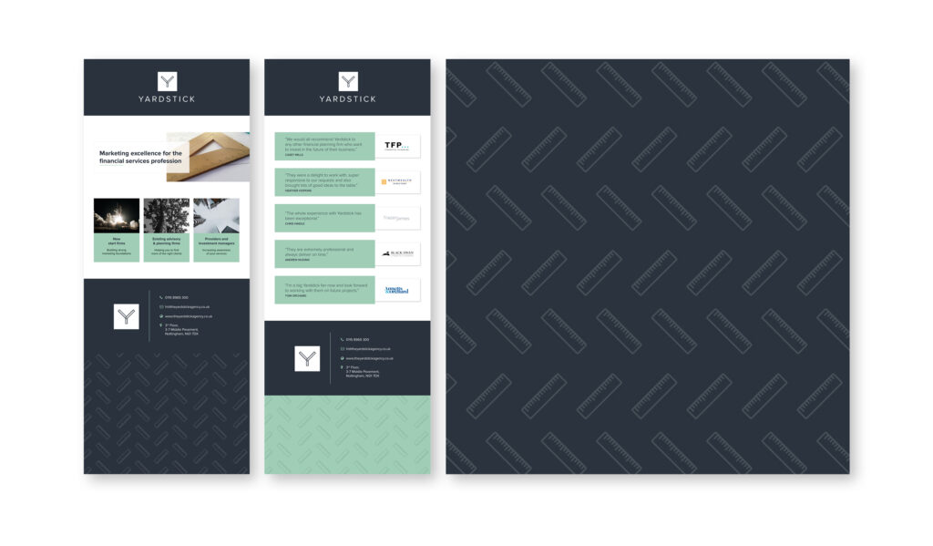
You rarely stare at a logo on a white background in complete isolation (perhaps you do, I don’t know your life. Get help maybe?). Mock-ups help us see how a logo looks on items such as business cards, letterheads, or pull-up banners.
It isn’t always crucial, especially in the early stages of a logo design. But it is always useful when a shortlist has been formed, and we’re deciding which is more effective.
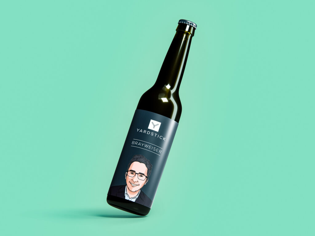
All kinds of fun mock-ups exist, like this refreshing looking beverage, with our very own Phil Bray peering out at you from your fridge. Enjoy responsibly, please…
But it’s relevant ones like this that can make all the difference in deciding a logo’s fate:
 3. Reflecting
This doesn’t mean just reflecting on our mistake in the bath 10 years ago.
Our brains are (generally) clever sausages, and when we review a logo it can be difficult to focus on the shape and composition rather than the actual content. To stop this, we can reflect the logo and see how it looks. If it isn’t balanced properly, the reflection allows us to see the shapes and elements, and we can do something about it.
It’s kind of like the famous trick for proofreading text backwards, or upside down or something.
Let’s look at our logo as an example. Now we’re not reading it, we can see that everything is well-balanced and as it should be.
When we are reviewing logos, we flip, reflect, spin and twist things to see where the problems lie, as it isn’t always obvious.
4. Blur the lines
This doesn’t mean blurring the lines on where a good spot is to eat a whole bag of chicken wontons.
Yes, hardy har, I nearly drowned, let’s just forget about it okay?
What we mean by this is making sure that the logo is at least somewhat distinguishable at a distance. You can’t control the circumstances in which your logo will be viewed, but you can absolutely make life easy for people. Things such as:
- Removing superfluous elements (which I appreciate is rich coming from my blog posts)
- Ensuring that negative space is balanced and reads well at small sizes
- Giving everything room to breathe.
For example, let’s poke ourselves quickly in the eye with a big rubber witches’ nose and look at our logo. You can see that it’s at least somewhat recognisable when it isn’t as sharp as a sharp thing.
![]()
Blurring often highlights issues in your design too and shows where overcrowding is occurring, and more space needs to be introduced.
And please don’t poke yourself in the eye with a big rubber witches’ nose. I did that once, but that’s a story for a different blog post.
5. Inspect the logo under a microscope
Zoom in and make things perfect.
In the early design phase of logo development, we focus on ideas and the bigger picture, rather than the tiny details. But once things are looking good in rough form, that’s when we can tighten it up.
The logos we create are always in vector format, meaning they can be scaled infinitely without losing any quality. It also means that we can zoom in 64,000% and make sure that every element is lined up and where it should be at the highest level of detail.
You never know what you’re going to find. For example, this is what you see when you get your eyes really close to the Yardstick logo:
![]()
So, what does this all mean?
There is more to the logo design process than just creating a few visuals. It’s something that requires research, an eye for detail and many rounds of review. Most of our clients don’t personally have the time or the inclination to do that, which is where we come in.
If you need any help designing a new visual identity, or revisiting an existing one; get in touch. You can email hi@theyardstickagency.co.uk or call 0115 8965 300.