What do Lidl and a sweaty Phil Bray have in common?
The answer somehow involves Steven Bartlett, a jar of jalapeños, and most importantly, you.
So, put your strongest reading glasses on and let’s explore why the small details matter in design, and how they can enhance or erode your clients’ confidence in you.
Let’s start with Lidl. I’m a big Lidl fan which sounds a bit like an oxymoron doesn’t it? You’ll often find me at my local store by the bakery at the back. They’ve got me hooked. The fact you can buy a two-person canoe or a clarinet in the middle aisle is pretty cool too, but that’s a whole other thing.
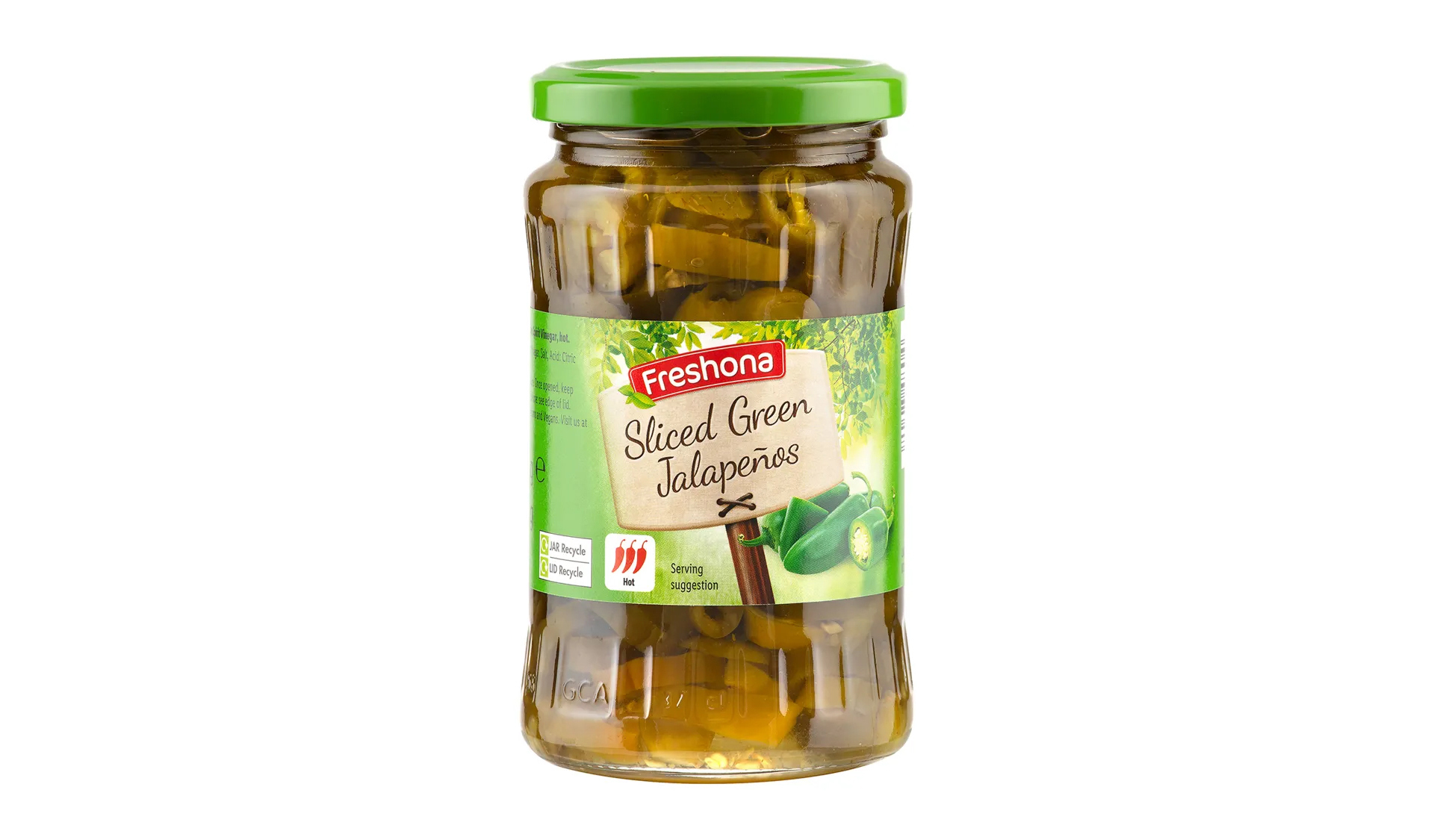
For now, let’s stick to the usual items you’d find in a supermarket, like a jar of jalapeños. Only, Lidl’s jalapeños aren’t “usual”. Let’s look at the label. I present to you exhibit A:

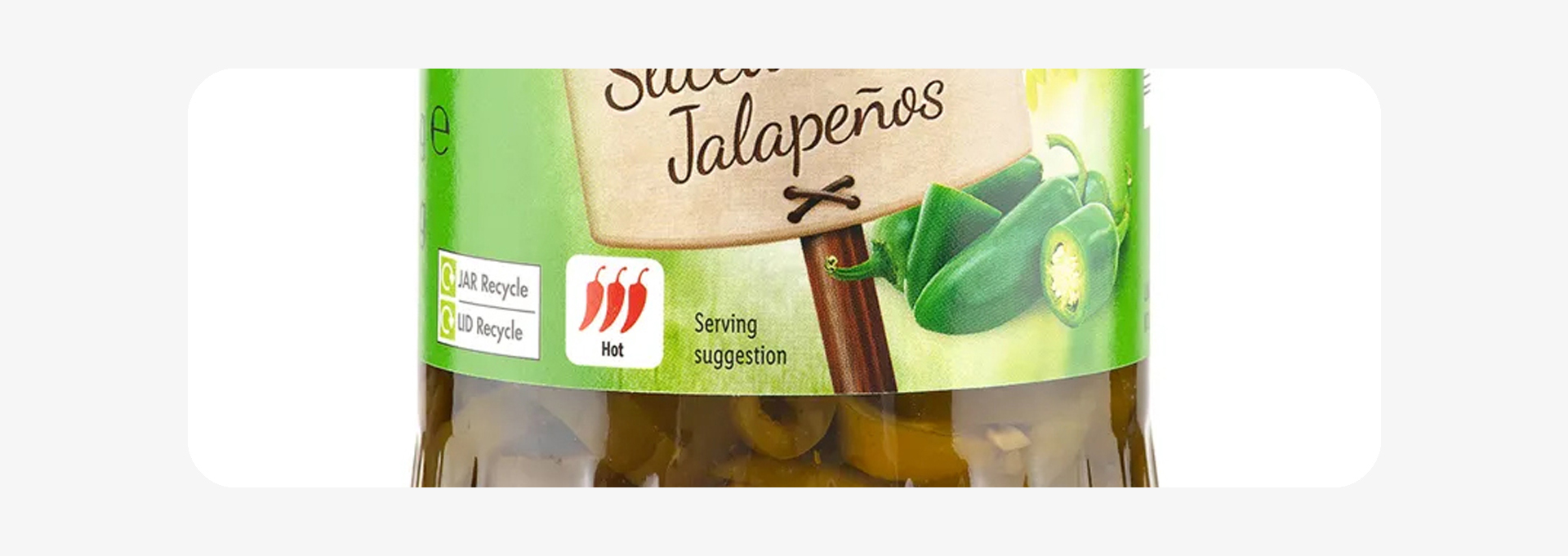
Perfectly normal, but let’s zoom in for the people in the cheap seats.

It’s a jar of sliced peppers, but the serving suggestions shows them whole, or halved. It’s only a tiny detail. Small stuff, right? But if they’ve overlooked that, what else have the got wrong?
It’s a niche example, and I will admit I still buy them by the jarful, but it got me thinking about something Phil has been talking about in blogs and on our webinars a lot lately.
Sweat the small stuff
Many of the advisers and planners I speak to on a regular basis have read Steven Bartlett’s book, The 33 Laws of Business and Life. Law 19 is all about how your attitude to the teeny tiny things that most people don’t care about can define your success.
Phil is a huge Bartlett fan, so it has naturally made its way into much of what we do. One thing to point out, of course, is that nobody gets the small stuff right 100% of the time. We’re all wonderfully flawed humans, like the people in charge of the jalapeño department at Lidl. But when we do take an active interest in dotting the is and crossing the ts, it instils confidence in your audience.
So, I thought it would be useful to pull together two examples of things I’ve seen recently, where small details have mattered, and how they could be easily fixed.
The Chartered mark
Many of our clients have attained Chartered status with the Chartered Insurance Institute (CII) either individually or as a firm. It’s something we like to focus on as a differentiator on their websites, brochures and other material as it demonstrates their commitment to delivering high-quality advice and following a demanding code of ethics.
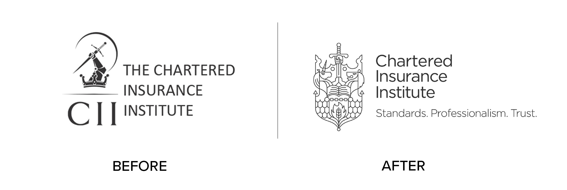
The CII rolled out a full rebrand over 2016/17, changing their logo:

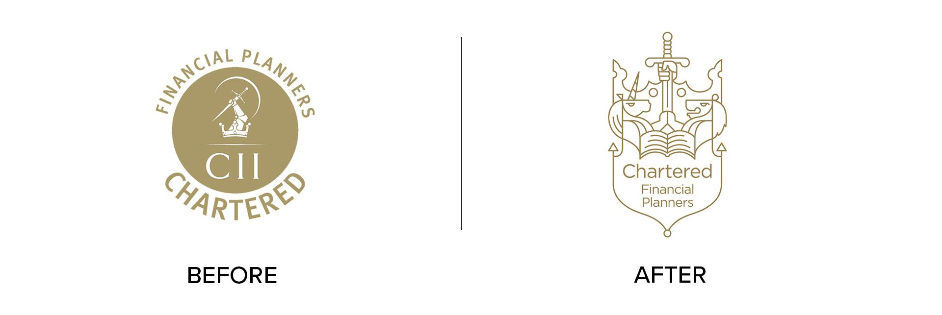
This came with a change to all the Chartered logos too. For financial planning firms it was this:

As you can see, the two are very different. But nearly eight years later, I still see Chartered firms using the old logo. Aside from going against the CII’s brand guidelines, it also undermines the commitment made to being held to a higher standard.
Small stuff? Yes. Important stuff? Also yes.
Watermarks in images
This one is less common than the Chartered mark, but always shocking when we see it in the wild.
When designing marketing material that requires photographs, there are a few options available:
- Commissioning a photoshoot
- Buying photography from a stock library.
I’m talking more about high-quality landscapes, or natural and candid shots of people. When people hear “stock photos” their minds can go to wacky overly posed shots, but you can buy some really high-quality stuff nowadays.
And naturally, good imagery costs money. So, when deciding on a final layout, it’s quite normal to use the low-resolution watermarked version of an image until you’re 100% happy with it.
But please, remember to buy the image and replace the watermarked version with the final high-resolution one! It sounds obvious, and any good designer will do this on autopilot. But more than once I’ve seen an example where the watermarked version went to print with a very faint “Adobe Stock” or “Shutterstock” watermark covering the entire image.
You could argue that this is the designer’s responsibility, and not your job to check (and you’d be right). The past few examples I’ve seen of this happened when they were created internally by somebody on the admin, ops or marketing team.
You might miss it if you’ve been staring at the document for hours, but your clients will spot it from a mile away.
A few bonus examples
Rogue watermarks and imposter Chartered logos might seem specific, but there are lots of broad things that people can commonly get wrong.
Take fonts. If a particular typeface is used throughout your brand, it’s important to keep that consistency. You might have different rules for internal documents, marketing material, digital use etc. but whatever the rules are, stick to them.
Adding in a random font because it’s your favourite, or you’re “bored with the usual font” (both excuses I’ve heard) will look like an oversight, and gently undermines the brand as a whole.
The same applies to icons. If you use icons to represent stages on a journey, client types, or particular services, make sure they’re all as consistent as possible. I wrote this piece a while ago, which highlights how different styles and line weights are crucial in helping an icon set feel coherent.
The way a logo contrasts against its background is also a common tripping hazard. When your logo was designed, you were likely given a version that sits on a white or light background, and one that sits on a darker background (usually the text and graphics will be inverted, and show as white).
Use both for different environments. We want as much contrast as possible so that your logo is identifiable and clear.
It’s the Lidl things…
If we’ve learned anything today, it’s where to buy a clarinet and a two-person canoe in the same shopping trip.
But hopefully we’ve gone a touch further and you’re now on the prowl for the little things you can fix to elevate your brand.
And when you do, we can help fix them – our design team sweats so much small stuff they have to drink four litres of Vimto at the end of each day, so they don’t perish. Email hi@theyardstickagency.co.uk or call 0115 8965 300.
Or just go to your nearest Lidl and look for the bakery – you’ll most likely find me there.


