Visuals are processed 60,000 times faster than text [Source: 3M].
So, when I’m gunning down Line 2 of the Dudley Canal in my green narrowboat and I see golden arches, I’m thinking about mooring up and filling my pigeon box with Happy Meals 60,000 times quicker.
An icon is a graphic that conveys meaning about a concept, thing or word through resemblance to a physical object. We use them all the time in our day-to-day lives:
Floppy disk = save that file (and my backside if my laptop dies)
Envelope = emails, so many emails
Crying laughing face = Good for you Daniel, you did a funny
You work in financial services, so you know the importance of explaining complex things in simple terms. Icons can help you do just that. But if you’re not using them properly, you’ll quickly find yourself crashing through a lock-in Stourbridge and cracking your weed hatch.
But before your little folding chair and least favourite child goes floating off towards West Bromwich, let’s explore the five giant oopsies you’re making when using icons.
1. Not using them at all
This is an easy fix; start using them!
Why?
Besides creating a contrast to text, and reinforcing important topics, iconography can be a useful tool when space is limited.
The most common reason I hear from clients who don’t utilise icons is that they don’t know where to start.
The assets that we work with tend to start life in two ways:
- Designing them from scratch based on a brief
- Using icon sets we’ve purchased as a starting point and editing them ourselves
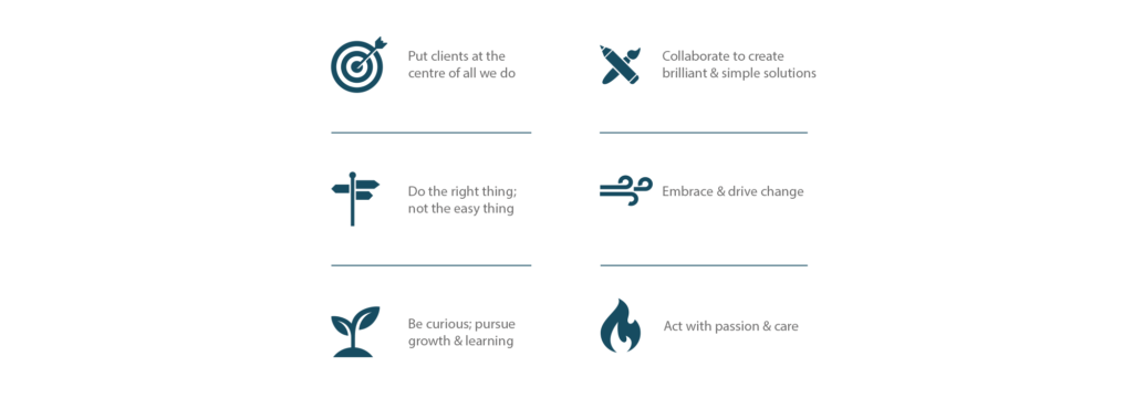
The latter is effective when we have a solid starting point, such as this set we tweaked to sit together well:
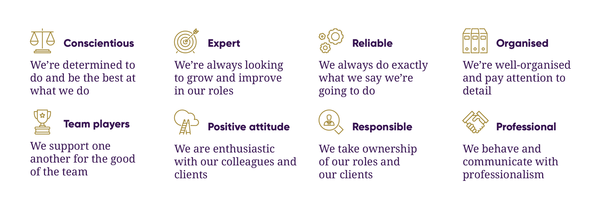
The former is necessary when we can’t find a remotely close foundation, such as this set we created to fit existing brand guidelines that a client had (note those lovely 45-degree angles – marvellous):

Working with a designer is a great way to develop a coherent and effective collection, but there are plenty of resources out there that can give you access to simple graphics.
They’ll make your online and offline presence fancier than these really upmarket birds:
 2. Using them inconsistently
Now, before you grab your paper bag and head towards the pick ‘n’ mix section, let’s think about how these graphics will be used.
The main advantage of working with a designer to develop your icons is that they’ll be able to make them work together as a coherent set. This means that the art style is the same, and they all share certain visual characteristics.
Why is this important?
Well, as our very own Phil Bray often says: consistency breeds confidence.
If you pay close attention to how things appear within your brand, clients will feel comfortable that you do just the same when it comes to their financial future.
Let’s take a look at a bad example, and show how we’d fix it:

As you can see, some icons are silhouettes, others are thin line drawings. Some have sharp edges, others are curved. Why is that one a different shade of blue? An extreme example perhaps, but you get the idea.

Look at that, much better!
They flow nicely as a set, and they become as consistent as this nightmarish fellow, forever smashing up the gaff.
Don’t let him in, or you’ll have more to worry about than just a cracked weed hatch.
3. Not incorporating your visual identity
So, you have a) got icons and b) they are all consistent.
What now?
Well, the way your brand looks and feels, from your logo to your colour palette and website design, should extend to your icons too.
This can be done in a number of ways. For example:
Colour coding the graphics to reflect your palette
If you’re working with a designer, they’ll probably do this by default, but it elevates the design and gives everything just that bit more of a finished feel.
Injecting your personality
Does your brand use a lot of hand-drawn elements? Then why aren’t your icons hand-drawn? Is everything super-modern, minimal and simple? The same logic applies.

It sounds like common sense, but all too often we see examples of jarring combinations of iconography that just doesn’t fit with the environment. Which is the exact opposite of my new Bob Ross toaster that sits next to the bilge pump, firing out really hot, permed bread.
4. Using irrelevant icons
A graphical representation of something only works if you can tell what it is.
How do you reduce a complex idea to a simple image? It helps to combine familiar connotations with abstract concepts. For example:
Not everybody is going to understand everything, but you don’t always need to be literal to be legible.
One thing that is absolutely irrelevant is the re-introduction of Turkey Twizzlers. Remember those? After being locked in Jamie Oliver’s garage for 15 years, they’ve finally been released into the wild to roam free once more.

Quick, get ‘em down you before he comes back again!
5. Ignoring your audience
You curate your imagery and tone of voice dependent on your target clients, so why get lazy with your icons?
You can’t please everyone, but you absolutely can look for those easy wins. For example:
- Do you show males and ignore females?
- Do older people look ‘too’ old?
- Do they show cliché corporate tropes that don’t reflect your clients?
You get the picture. Put yourself in your client’s shoes and ask, “does this represent me?”.
I asked myself the same thing when I put these three elegant garments in my basket on Black Friday.
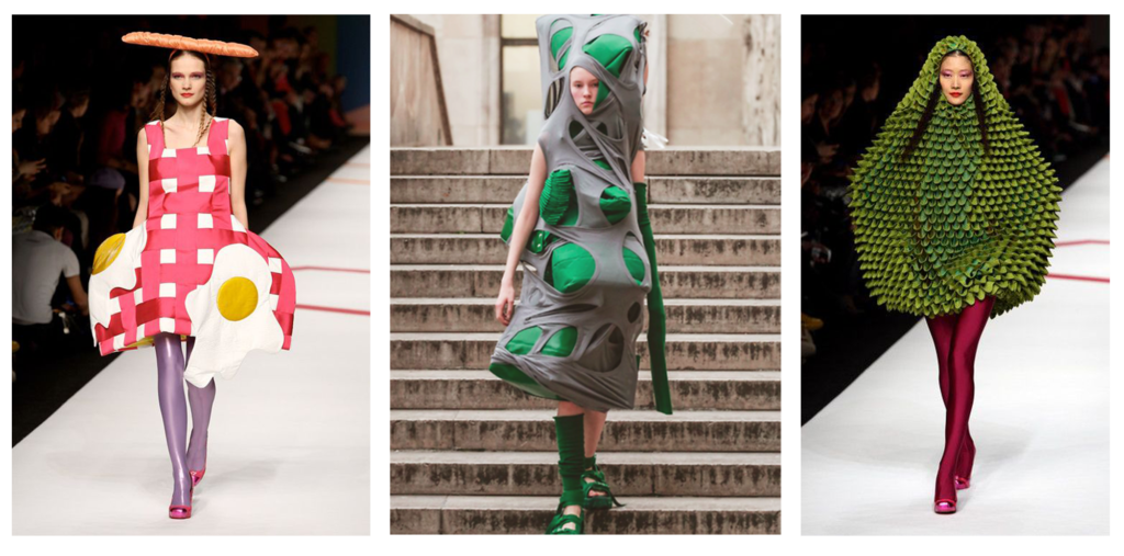
“Yes” “yes” and “yes” was the answer.
“Okay, you had me at ‘Mr Blobby’, how can you help?”
They say a picture is worth a thousand words, but even if it’s only worth two words you’re still in profit.
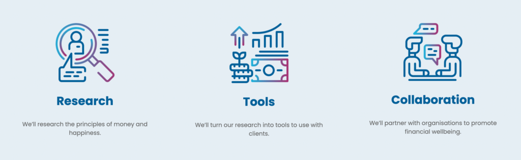
Utilising iconography is something we carefully consider with all of our projects, whether it be a website design, printed stationery and collateral, or any miscellaneous documents.
Get in touch with us at hi@theyardstickagency.co.uk or call 0115 8965 300 if you’d like to find out more about using icons, jet washing a narrowboat or dry cleaning a fried egg costume.