- More than 1 in 5 UK consumers have a disability.
- 73% of disabled website users experience barriers to access on more than a quarter of websites.
- UK users who click away from inaccessible websites have an estimated combined spending power of £11.75 billion.*
For most people, the internet has meant an opening up of the world. It has allowed us to gain access to information, education, support and opportunities that might not otherwise have been there. However, for many people, that information and those opportunities are off-limits because of websites that are incompatible with their disabilities.
What do we mean by “accessibility”?
A fully accessible website allows anyone with a disability to access it. That means, if you create any digital content, you need to write, design and develop that content with disability in mind.
This leads to another question… What do we mean by “disability”?
Consider this: You are a new parent, with a tiny baby crying in your arms. You are trying to access important newborn health information online. Are you disabled?
You may not think of yourself as disabled: you’re not injured, and you don’t have a health condition or disease. But consider this definition: “A disability is a mismatch between a person’s abilities and their environment.”**
Now, are you disabled?
Well, almost certainly so if baby’s cries mean you can’t hear the audio on the videos you’re trying to watch. Almost certainly so if the website you are trying to navigate one-handed requires precision motor skills. And almost certainly so if you’re running on no sleep and being asked to read large blocks of tiny text and complex terminology.
Looking at disability in this way, it’s possible to see that disability can be more or less of a problem depending on a person’s environment. This means that a person’s disability can be reduced if their environment accommodates their needs.
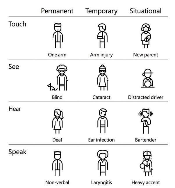
Microsoft’s inclusive design chart
We tend to categorise disabled people as a specific and separate audience. But in many cases, having a disability means having more trouble doing something that’s hard for everyone. With or without a visual impairment, we all struggle to read green text against a red background and hear voices over loud background noise.
Tackling accessibility challenges benefits everyone because users of all types will have a better experience.
Writing for inclusivity
1. Write in plain English
The average reading age in the UK is nine years old. Your first thought after hearing that statement might be “yes, but not the users of my website”. And that may be correct. But one thing remains true: the higher the reading age of your website text, the fewer people will be able to access it.
Use metaphors or colloquial phrases carefully, only when you are confident your audience will understand their indirect meaning. Users for whom English is a second language, and some neurodiverse users struggle to understand phrases that don’t have a direct and obvious meaning.
Avoid jargon. If you’re writing for subject-matter experts, it makes sense to use industry terminology. However, you should only do so where you are sure your audience is familiar with that language. This guide on writing for domain experts has some good advice on how to do this.
Using plain language doesn’t mean making your content boring or unappealing. The skill of a good copywriter is in creating compelling, engaging content with as few barriers to understanding as possible.
2. Avoid unnecessary long words
Repeat after me: You do not need to use big words to convince people you’re an expert. I like to periodically remind myself of Einstein’s wisdom on this:
“If you can’t explain it simply, you don’t understand it well enough.”
Use high frequency words wherever possible. The more syllables a word has, the higher the reading age required to read it. So, if a short word can replace a longer one, do it.
- “use” instead of “utilise”
- “help” instead of “assist”
- “start” instead of “implement”
- “if” instead of “in the event of”
3. Avoid overly long sentences
When an average sentence length is 14 words, readers understand more than 90% of what they read. At 43 words, comprehension drops to less than 10%. Aim for an average sentence length of 12 words, with no sentence ever being longer than 25 words.
4. Think about the structure of your content
Don’t overload a page. Make it easy for people to scan for the information that is relevant to them. Use features like headings, subheadings, bulleted lists, and plenty of white space to make content easier to read.
Organising web pages by headings helps users navigate the page’s organisation and structure. Do not use bold for a heading. Though the text may look like a heading, the underlying code is not set correctly, and screen reader users will not benefit. Instead, use H1 – H6 settings for your headings. When you do this, screen reader users can listen to a list of the headings and skip to the desired section.
5. Test readability
A Flesch-Kincaid score tells you how easily understandable your text is to read. You want sentences with a “Flesch reading ease score” of 60 or above. The higher the score, the more readable the sentence. To find the Flesch-Kincaid measure in Microsoft Word:
- Click the Microsoft Office Button, and then click “Word Options”
- Click “Proofing”
- Make sure “Check grammar with spelling” is selected
- Under “When correcting grammar in Word”, select the “Show readability statistics” check box
- After you enable this feature, open a file that you want to check and check the spelling in Review > Spelling & Grammar. When Word finishes checking the spelling and grammar, it displays information about the reading level of the document.
If you can’t access it via Word, try this online Flesch calculator which will also tell you your average words per sentence and syllables per word.
6. Write descriptive hyperlinks
To ensure your hyperlinks and buttons are accessible, they need to make sense on their own. As a general rule, avoid linking single words such as “here”. Screen readers may not read the text in the same order as someone looking at the page. Your user can therefore be left not knowing what “click here” and “this link” refer to.
Designing for inclusivity
1. Use alternative text for images
Alternative text, often called “alt text” describes visual elements of your website to visitors who can’t see them. It’s used by screen readers and can also be changed into large print and braille.
Be specific when writing alt text. “A photo of a woman at a desk” doesn’t tell the user whether she is stressed, concentrating, laughing or staring into space. If you’ve taken the time to choose an image to illustrate a point, take the time to ensure everyone can understand the point.
Instructions on how to write good alt text can be found here.
2. Add transcripts or subtitles to videos
Around 19% of the UK population have some sort of long-term hearing impairment. So, adding subtitles or a transcript can help to bring 1 in 7 people with hearing impairment into the conversation. But it also includes those people who don’t have any headphones on them and don’t want to play content out loud in a public space.
3. Use large fonts, links, buttons and controls
People with motor impairments will be impeded by controls that require precision motor skills.
While there is no official minimum font size for the web, it is generally agreed that the main body text should be a minimum of 16px. All text should be capable of being resized by up to 200% from its original size.
4. Ensure adequate colour contrast between text and background
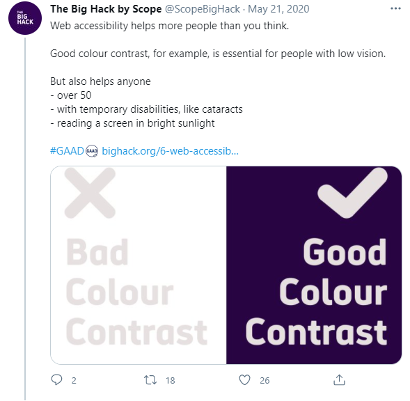
For a significant number of people, there are some shades and colours that are hard to tell apart. 1 in 12 men and 1 in 200 women have a colour vision deficiency. That said, most of us would struggle to read the pale grey text on the white background used in the image above. Carefully selected colour contrast allows more people to access and benefit from your content.
You can use this free contrast checker by Web AIM to see how your website colour scheme fares.
Conclusion
Making your website accessible is crucial if you want to ensure you are connecting with the largest possible number of people.
Accessibility isn’t just about compliance. It’s about being inclusive and opening up your service to everyone.
There are lots of tools available which will help you discover how accessible your website is. But of course, the very best way to learn about people’s experiences of using your site is to ask them. No amount of theory can replicate the insight of a broad range of users.
If you’d like to create an accessible website, we’re here to help. As a team of digital experts, we use our knowledge to create websites written, designed and developed for all users. Which frees up your time to concentrate on doing what you do best – helping clients to achieve financial confidence.
* Figures from https://wearepurple.org.uk/
** Definition courtesy of “Disability Science Review”, 23 December 2016; https://medium.com/@mosaicofminds/a-disability-is-a-mismatch-between-a-persons-abilities-and-their-environment-cc39e29e8e74