What’s the small hill you’re gonna die on?
Come on, this is a safe space – I won’t tell anybody. Unless it’s really unhinged in which case God help us all.
Maybe your thing is grammar. You won’t let it go when people say “anyways” instead of “anyway”. Or you won’t let anybody “borrow” you anything. You’d rather die unless it’s “lent” to you.
Or is it more serious than that? Are you one of those people who refuses to put their shopping trolley back properly even though you’re perfectly able to? You’ll say, “Oh that’s somebody’s job to do that”. Unless the trolley has got your pound coin, in which case it’s suddenly not somebody else’s job because you want your quid back.
Let’s ramp this up. Perhaps you’re one of those smug people that likes to say we can’t have pineapple on pizza. If so, thank you for your hard work. We’re all very impressed that you have an issue with what we’re putting on our own food.
Wow, I have feelings about this stuff, don’t I?
Now, the above three things are all typical small hills. Nothing out of the ordinary there.
But my thing isn’t small, it’s a big old mountain. It’s not just something that pulls my parsnips – it’s something that ruins the user experience of your website! Gasp. Shock. Horror.
Yes, it’s my turn to write a Yardstick blog, so prepare yourselves for the usual kinda-helpful, mostly-ranty descent into madness.
My small hill is justified text
I feel ill just writing the words. But let me power through. I’ll be brave.
See, justified text is when space is added between the words in a passage, so the edges of both sides are aligned with the margins.
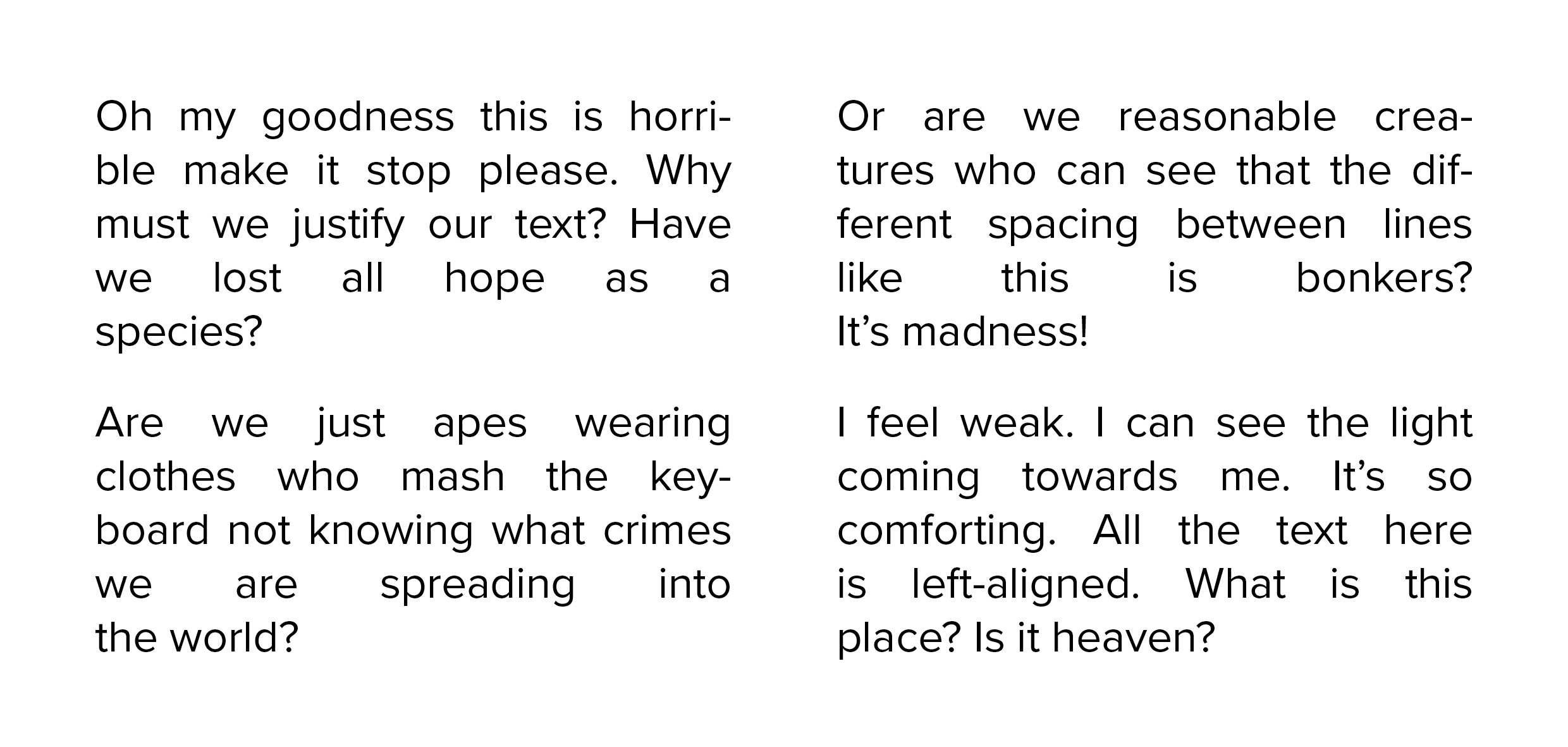
Let me dig out an example. I’ll close my eyes while I paste it in. Don’t look for too long or you’ll catch a fever.
For those who are still with me and haven’t just perished, I don’t want you thinking that I’m an old man yelling at clouds. My strong opinion is backed up with the power of science – more on that later.
And I should probably point out that this isn’t a super common issue we run into. For the most part, people accept that text reads better when properly aligned. But every now and then we get a project come back with amends to “fully justify the text throughout”. The rationale? “It looks neater!”. I’d like to say that when we push back, people agree with us and accept it.
But the fact that I’m overheating while writing this and my nose has just started bleeding probably gives the truth away.
By the rivers of badly set text, there we sat down
Before you say: “But Dan, books have justified text!” I know they do.
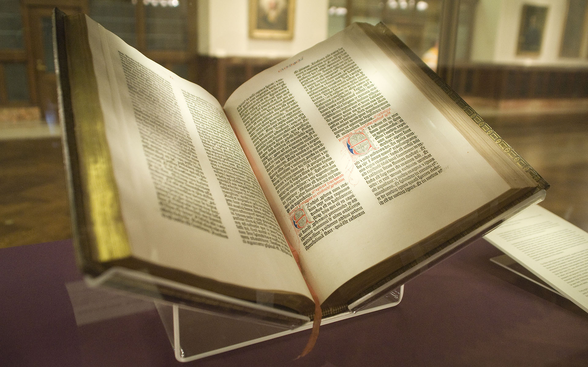
Let’s take a trip back to the 1450s when this guy was cutting about the place – the father of the modern book.

Johannes Gutenberg had three rad things going on.
His beard split into two halves for some reason, he owned a really comfy looking hat, and he was introducing letterpress printing to Europe with his movable type printing press.
There weren’t too many books knocking about 600 years ago, so Gutenberg chose to churn out a bunch of bibles. The 42-line Gutenberg Bible is the first modern book printed in Europe, and look – it has justified text!
There are a few reasons for this:
Books cost a small fortune to make, and you can fit more words on a page with justified text. In fact the first few pages of the Gutenberg Bible have 40 lines of text before it changes to 42.
And remember, this was a holy text, so lots of flourishes and decorations were added – justifying the text gave everything a square container to sit them in.
Finally, and more practically, each page had two columns of text on. Justifying it helped them keep an equal distance between each column on the printing press which saved time (and therefore money).
Over the past six centuries, book printing technology has advanced a ton. However, justified text still allows more words to be packed into fewer pages, so open up any book you’ve bought recently and you’ll likely find it in there.
Accessibility, accessibility, accessibility!
Gutenberg didn’t care too much about accessibility in the 1450s because most people couldn’t read. For context, the average worker would have to save three years of their salary to pay for one of his bibles.
You don’t have the same excuse though.
While it’s all fun and games to watch me get dramatic about justified text, you are making a mistake if you use it within your website, brochures, and disclosure documents:
- It can be harder for people with dyslexia to read
The British Dyslexia Association have a style guide, and would you guess it – justified text is named and shamed as bad practice. They state that you should:
- Left align text, without justification. This makes it easier to find the start and finish of each line and ensures even spacing between words.
- Avoid multiple columns (as used in newspapers).
- Write short simple sentences: 60 to 70 characters is optimal.
- Use white space to remove clutter near text and group related content.
- Break up the text with regular section headings in long documents and include a table of contents.
With an estimated 1 in 10 people in the UK having some degree of dyslexia, why would you sacrifice their user experience just so “the text can be neat”?
- It relies on hyphenation
When all lines need to be the same width, long words are often hyphenated. This comes with its own problems for readability and the general flow of the text, but it’s made even worse when short words are hyphenated.
- Uniform lines can cause readers to become lost
How many times have you found yourself re-reading a line of a book by accident? Or even worse, skipping a line or two? No big deal when it’s Kevin Keegan’s autobiography right? But what about if a client skips an important line about fees?
- Rivers appear within the text
With justified text, the outside container is neater but the inside is more chaotic. Take my dramatic example from earlier:
You can see that large channels appear inside the text box – these are called rivers. These disrupt the flow, as they are caused by inconsistent spacing between words.
Take line three of the first paragraph for example. Because the word ‘species’ wouldn’t hyphenate properly onto the next line, the distance between each word is stretched to fit, causing visible gaps.
“Never justify text.” – University of Cambridge
If you look into the research on justified text, you’ll find a slightly mixed bag. Universities such as Harvard, Princeton, Cambridge and Oxford all have policies against justification from an accessibility point of view.
To give a fair argument, I will point out that Google are slightly contrary, with this article that ultimately says “readers are resilient, they’ll read the text however it’s set out”.
Adding a hurdle seems like a bizarre thing to do regardless of how resilient the average reader is. But resilience and accessibility aren’t the same thing. Some people physically won’t be able to take in the information if it’s set out in a certain way. Why take the risk just because you think it ‘looks neater’?
Please, I want to live…
I don’t want to die on a small hill. I want to run barefoot and free! To ensure that your next project doesn’t fall foul of any accessibility issues, email hi@theyardstickagency.co.uk or call 0115 8965 300.
And if you are able to – fling that shopping trolley back where it belongs. It’s the right thing to do.