So, Mr Black has been struck down by a conveniently colourful cast of shifty mansion-dwellers.
Typical.
It’s time to grab your deerstalker, your glass eye or some of David Suchet’s leftover moustache wax because we’ve got a crime to solve. But, before we start stomping about the gaff in search of clues, a question…
Why is colour so important?
Here’s a fun fact; it was once punishable by death for an IFA firm to use any other colour than blue for their branding. The rules have relaxed somewhat in recent years, but many are still galloping around with their little blue blinkers on.
The above is said (partly) in jest, but you get the idea. There are so many firms that still use a strict, super corporate navy blue that has been with them since the beginning of time. This would be fine, providing it reflects both the advisers and the clients, but it so often isn’t the case. And it can be jarring to those clients when they are dealing with a friendly, personable adviser when the branding is stuffy, old-fashioned and lacks personality.
Blue is a safe option, often associated with:
- Being social (It’s no accident that Facebook, Twitter and LinkedIn share a primary colour)
- Calmness and peace
- “All Rise”, “One Love” and that one they did with Stevie Wonder
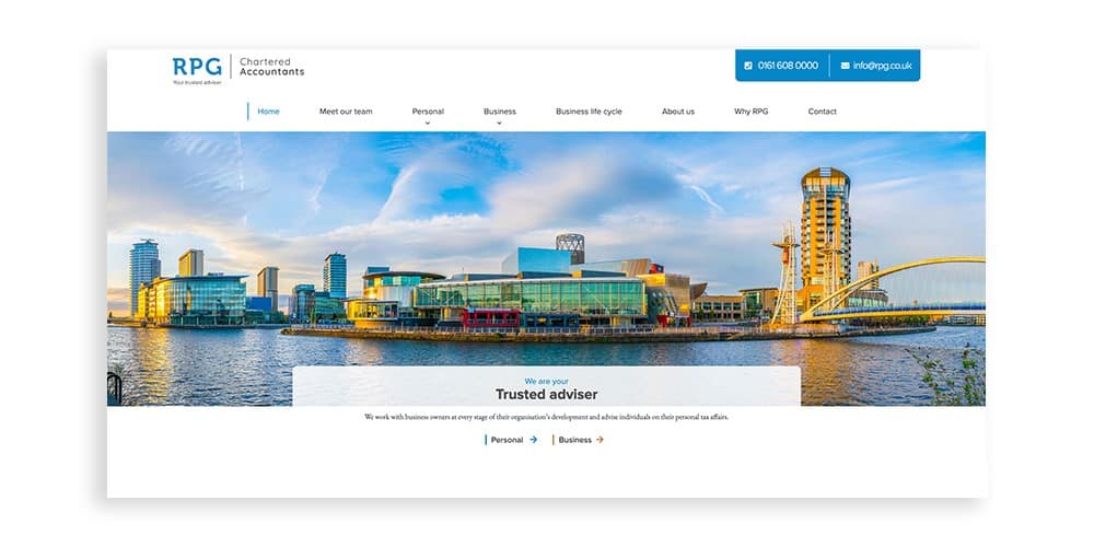
But, playing too safe with colour can put you at risk of blending in with everybody else. The RPG Chartered Accountants website is a great example of blue working well with an orange accent, and vivid imagery.
Miss Scarlett in the kitchen with the candlestick
Red can be a polarising colour to include in your palette. You’ll often hear shouts of “it’s the colour of danger!” and “This Cluedo metaphor is horribly contrived!” both of which are perhaps true.
For the financial sector especially, red can be a tricky colour to work with, but it’s not impossible.
Take the Red Circle Financial Planning website as an example. Red in both name and colour palette, it is one of our designs that gets a clap or two from strangers. The key is balance. White and grey are combined with carefully selected images to create a strong outcome that doesn’t yell ‘danger!’ at the top of its lungs.
Red is an underused option, often associated with:
- Excitement
- Confidence
- Submarines (and believable Russian accents that definitely aren’t Scottish)
So don’t be too frightened of it.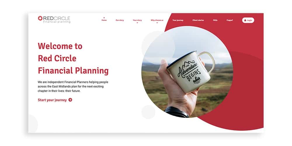
Rev. Green in the ballroom with the dagger
Many brands use green as a primary tone in their palette to shout about how fresh, sustainable or natural they are.
Sometimes it’s apt and works well for them. Other times it gets linked with spilling five million barrels of crude oil into the ocean (an admittedly rare situation where no amount of carefully curated colours can repair a reputation).
For the financial sector, green can split opinions.
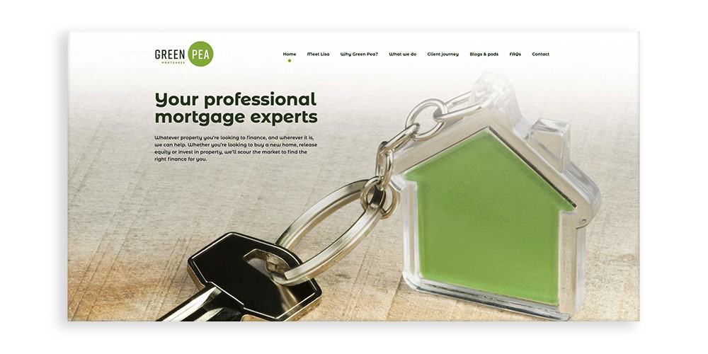
I’ve had my share of conversations where green has been discounted as an option because it’s ‘the colour of envy and greed’. We’ve all heard the phrase ‘green with envy’, but there are far too many firms out there successfully using the colour for me to advise against it, such as Green Pea Mortgages, shown below.
Green is a reliable option, often associated with:
- Growth
- Nature
- Sleeves
Just be careful of getting Miss Scarlett involved because things get Christmassy very quickly…
Colonel Mustard in the conservatory with the lead pipe
Colonel Mustard isn’t a very popular chap, and not just because of the whole ‘murdering people’ thing he’s often accused of.
Using yellows and oranges in your palette can create excellent results, but many people I speak to in branding workshops are dead set against it. Interestingly, the most common reason is: “I personally don’t like the colour”.
Phil wrote a while back how ‘it’s not always about you’, and he’s absolutely right. Don’t assume your clients won’t engage and respond to something simply because you’re not a fan. Especially with colour – you can rule out the whole rainbow if you’re not careful, so keep what is right for your clients well in mind.
Yellow is a versatile option, often associated with:
- Happiness
- Energy
- Snow you should probably keep away from
We find that it’s underused in the financial sector, and can create very impactful outcomes, like with High Edge Financial Planning, shown below.

Professor Plum in the dining room with the revolver
Purple gets a bit of stick for being ‘old-fashioned’, and perhaps unfairly so.
Sure, the Queen is often seen pottering about in a nice lavender outfit, but that doesn’t mean that it’s restricted for use in more traditional environments. In fact, the website we worked on for Hunter, Aitkenhead & Walker is a great example of purple being used in a clean and contemporary way, with the introduction of a fresh green and heaps of white space.
Purple is a strong option, often associated with:
- Wealth & luxury
- Ambition
- Rain (great album, not so great film)
But be careful how you use it. If showing that tradition and heritage is important, it can work wonders as-is. But as was the case with Hunter, Aitkenhead & Walker, it may need a bit of tweaking if a modern look and feel is the aim.

Mrs White in the study with the spanner
We can’t finish our questioning without giving Mrs White a bit of a grilling.
White is never going to be a primary piece of your palette, but this is the perfect opportunity to sing a little ballad about the importance of negative space. Letting the tones in your palette breathe, and giving them the right balance will elevate your visual identity, and make so much more of what is on the canvas.
And negative space doesn’t mean sticking everything on a white page and hoping for the best; this could be on a dark background or set against an image or graphic. Just give the pieces in the composition the right amount of room, and be careful of overcrowding, as the Red 7 Financial Management website has done, shown below.

So whodunnit?
Or perhaps, a better question; what colours should I be using in my branding?
As you can see, it’s not as simple as sticking a few convenient assumptions together with crude colour psychology.
Building a palette is a delicate balancing act, and a vital part of the overall branding process. Of course, there are plenty of tones that we’ve not mentioned, but the logic is the same. Approach colour with an open mind, put your target audience ahead of your own preferences and begin the conversation with logical questions such as:
- What colours do our immediate competitors use?
- Does our company name lend itself to a particular tone?
- Are there any local things we do or don’t want to be associated with?
Want to know more? Get in touch with us at hi@theyardstickagency.co.uk or call 0115 8965 300.
Sources
[1] University of Winnipeg: https://ion.uwinnipeg.ca/~ssingh5/x/color.pdf