The best thing about fonts is that everyone can access them.
The worst thing about fonts is that everyone can access them.
It makes them dangerous.
It’s kind of like how most people have a big block of knives on their kitchen counter. Just because they’re all there, it doesn’t mean you need to grab them all and run about the place shouting.
We need to respect them, use them safely, and choose the right one for the job. Or, before you know it, you’ll have chopped the end of your finger off while you’re making cheesy mash (which our Head of Business Development Louis definitely did not do three weeks ago…).
But why should you care about typography?
*Inserts old man yells at cloud meme* – BECAUSE YOUR CLIENTS DO!
It’s a powerful visual tool that communicates who you are
When building your visual identity, much emphasis is generally spent on things such as:
- Imagery
- Colour palette
- Iconography
- Animation
Typography, in my experience, is the element most likely to be forgotten.
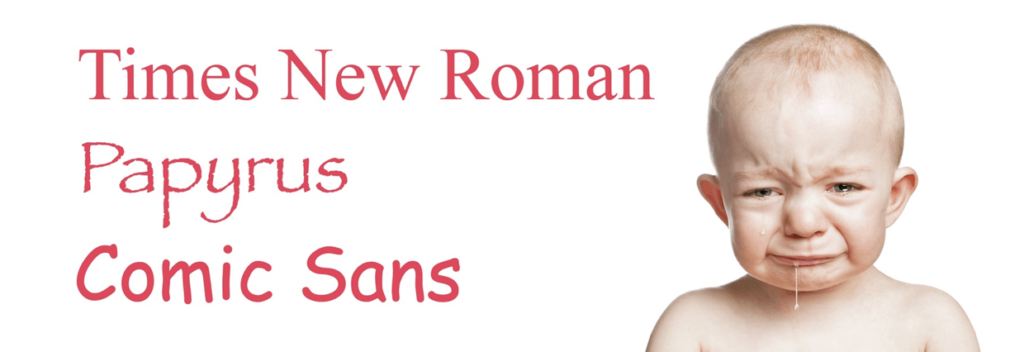
“Oh, it’s fine Dan, we’ll just use Times New Roman” people will say, and at that very moment, a single tear rolls down my cheek.
“Okay then, how about Papyrus?” (they will likely cackle at this point). More tears from me, I’m afraid.
“What about Comic Sans then? And why are you howling uncontrollably in the foetal position?”
The fonts you choose can convey a number of things:
- What your values are
- Who you work with
- Why people should choose you
Of course, this isn’t in isolation. These things are communicated through your points listed above, but if there is a disconnect with your typography, it will have a negative impact on the coherent brand you are trying to build.
It affects the split-second test
Phil often writes about the split-second test, which means your website must show the audience:
- What you do
- Who you work with
- Whether you can address their trigger
If your font choices are all over the shop, with no regard for your target audience, they probably won’t stick around for long.
The medium is the message
If you’ve ever been in a heated argument with your ex-landlord’s milkman, then you’ll have heard “It’s not what you said; it’s how you said it”. Typography is no different.
Showing a piece of text is one thing; crafting it in a considered visual manner is another.
As the Head of Branding & Design at Yardstick, I perhaps give more of a font about typography than Joe Bloggs (or Joe Little Carrot as he’s called in Slovakia). But not by much, as the smart folks at the Massachusetts Institute of Technology found when they explored how typography impacts reader engagement (Source: MIT).
‘Good typography’ (i.e. legible, optimum spacing and appropriate for the subject matter) improved engagement and mood when compared to ‘bad typography’ (i.e. inconsistent spacing, illegible font choices and poor header hierarchy).
It instils confidence when used consistently
When you are building an effective brand and cultivating the association of your visual identity with your values, consistency is key. Constant reminders that the audience is in the right place should be given, whether that be colour palette, photography style, or in this case, typography.
Having a small and stable selection of fonts will help to ease any uncertainty or doubt; going rogue and flinging your brand guidelines out of the window will likely do the opposite.
It assists with the delivery of content and establishes a hierarchy of information
Look at the way this page is laid out.
Unless Kayleigh, our Marketing Assistant has decided to take the Picasso approach when uploading this article, everything should be very clear:
- Headings and titles are shown in a different size and colour to this body copy
- Links are obvious and easy to identify
- The spacing between paragraphs is just right, and allows everything to breathe
Please don’t let me down, Kayleigh.
This hierarchy is important as the more time you spend navigating the site and engaging with content, the easier it is to identify where you need to go next, and what to look out for.
This isn’t limited to your website. Your client-facing collateral, such as terms of business and client agreements will have similar levels of headings and body text.
It can be tailored to appeal to your target client persona
There are more fonts out there than you can run outside and shake a stick at. Type foundries release new ones every day, which means you’ll get sore arms and dirty looks from your ex-landlord’s milkman if you try.
Fonts are generally sorted into the following categories:

Serif: Named for the embellished strokes that adorn each character. Serifs often give a traditional look and feel with contrasting line widths.

Sans-serif: Literally lacking serifs; this category is home to many modern and well-known faces such as Helvetica, Gill Sans and Futura.

Slab serif: The ‘slabs’ are thick, blocky serifs that were originally created to increase legibility at a time when printing processes were a bit janky.

Script: Based on handwritten letterforms, script fonts are fluid, human and can give a personal feel.

Blackletter: Are you a German brewer, or a heavy metal trombone player? Look no further. It’s somewhat limited in practical applications, but as it was the first kind of lettering used, there are plenty of styles knocking about.

Monospaced: These guys are named for the fact they occupy the same amount of horizontal space. They don’t win any beauty contests, but they were invented so that typewriters didn’t catch fire or something.

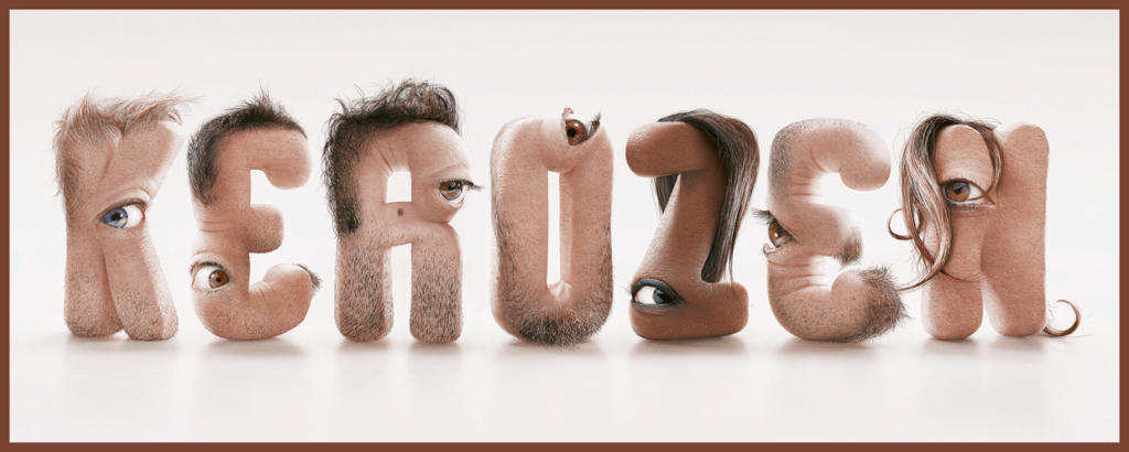
Decorative: This is a bit of a catch-all, and has many of the above within it, often with more playful and display-oriented designs. It gets an honourable mention because of the disturbing typeface below, created by Jean-Charles Debroize for French special effects studio KEROZEN. I can’t unsee it, and now neither can you.
They aren’t mutually exclusive, so you’ll often find slab serif monospaced, or serif decorative fonts, for example; but you get the picture.
It adds contrast and harmony to your visual identity
A common question I’m asked is whether the font used in your logo must be the same as that used everywhere else. The answer: heck no!
Think of it like this. If I’m going to wear a handsome pair of dungarees, and I decide to pair it with my denim jacket and denim hat, I’m likely going to have people avoiding me on the beach.
Using a small selection of fonts that fit well together can elevate the overall design of websites, collateral and stationery. But make sure they contrast each other well. Too much of the same thing will wear people down. Add variety, but ensure it is carefully considered.
Think of fonts like giant plates of Louis’ cheesy mash; two or three is enough, any more is just going to upset you (and you might find a fingertip sitting in one of them).
So, do you give a font about typography now?
As you can see, saying something is one thing, but choosing how to show it is an entirely different trout to tickle.
Look beyond the standard set of fonts that arrive neatly packaged in Microsoft Word, and you’ll find beautifully designed options that capture the essence of your brand.
Want to know more? Get in touch with us at hi@theyardstickagency.co.uk or call 0115 8965 300.
Sources:
https://theyardstickagency.co.uk/blog/the-trap-too-many-financial-planning-websites-fall-into-4052/