When I’m bored, I find myself doing a myriad of different things, and one of these is reading webcomics. One of my favourites is by a man named Matthew Inman, better known as The Oatmeal. My favourite mini-series of his is titled Minor Differences where he takes a look at mundane things and changes them ever so slightly to drastically change their meaning.
Re-reading this series of comic strips made me think about how changing things ever so slightly on your website can have a huge impact not just on how the site looks and feels, but also how users interact with your site.
I’m nowhere near as skilled as The Oatmeal is when it comes to art, so I am unable to continue this blog with a comic-like infographic below. However, I am more than capable of talking about a few things you can change or maybe don’t want to change, to ensure your website visitors have the best experience.
Closing a modal
A modal, or pop-up, is a common thing to see across the internet. Many websites will use them for a wide range of things; asking you to sign up to a newsletter, agreeing to terms and conditions, confirming a choice, etc.
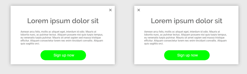
Here we have two modals side-by-side, with one subtle difference. The cross to close the modal is on a different side.
Anyone who is using an Apple computer, whether that’s a desktop or Macbook, would have no issue with the close button being on the left, as that is where a cross is on MacOS. However, for a lot of users on the internet the close button has always been in the top right.
By moving the arrow to the top left, you may find users won’t know how to close your modal, especially if clicking outside of the modal doesn’t close it. Instead, they may close the browser, or press the back button as that is the only option they see which may close the modal.
Title justification
Justification, or how your text aligns, can convey a completely different meaning and change how a user would perceive a page.
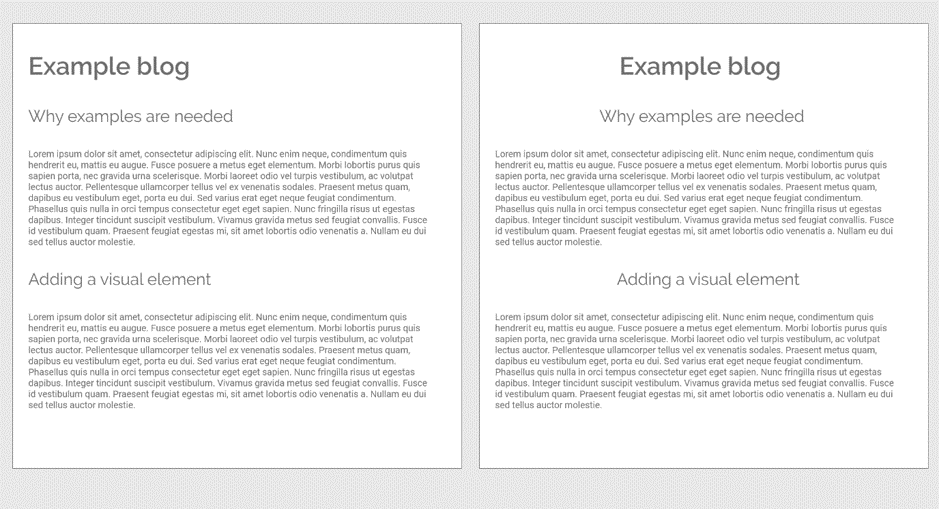
Without changing any content, you can make a page look more spaced out by changing how your titles are justified, and the body text too if it isn’t too large. Large amounts of text are easier to read left aligned (right aligned for a language which reads right-to-left such as Arabic or Japanese).
Overlays
An overlay can ensure that your text will always be legible.
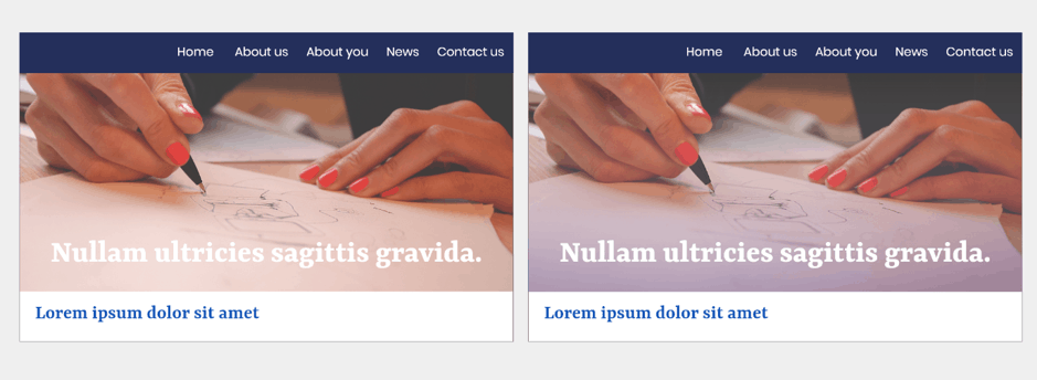
If you use white text to cover all banner images, but on one page you have some paper or a cloud, it may cause your text to be illegible. To fix this, you may think about trying to find another image which fits but may not be as ‘perfect’ as the current image.
If this happens, a slight overlay over the image may be all you need to ensure the text is easy to read and doesn’t ruin the image.
Keep it conventional
If you have a specific colour scheme for your brand, you may be inclined to keep that colour scheme throughout your entire site.
When doing this, you need to be cautious of what your users associate that colour with though.
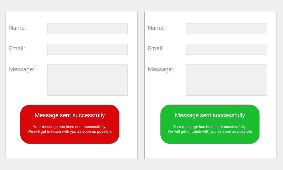
Consider the example above. If your brand colour is red, you might want a success message to also be red.
If you decide to go with your brand colour of red, a user will need to read the message as they assume they have done something wrong or the form didn’t submit. They may not even read the response, choosing to fill it out and submit it again.
If you choose green, your user won’t need to read the second form response, as they can see the green.
Font choice/size
If your business is targeting younger people, then you may not need to worry as much about the size or style of the font you are using. Conversely, if your site is targeting those later in life, you may find that the size used is quite hard for your users to read.
Along with this, you need to consider whether your users would understand any iconography you use. It may add meaning to some people, but not everyone.
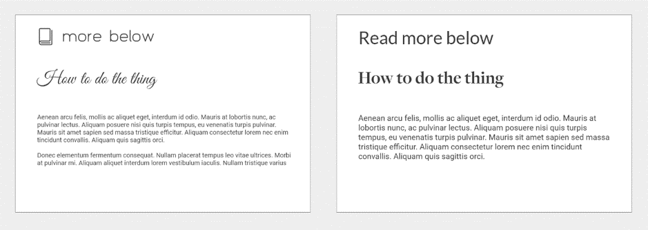
Depending on your screen size and level of zoom, the text in the former may be quite easy to read, however, this definitely won’t be the same for everyone reading this blog article.
Sometimes it’s good to have a second pair of eyes look at your site before you launch it to the world. Whether it’s a colleague, a friend, or a family member, having someone see the site on their screen and navigate it without knowing how it’s meant to look and function could give you some valuable insight.
It also ensures that you don’t get multiple emails from a user trying to submit a form, complaints that they can’t read your latest blog article, or nothing at all as they left the site because your newsletter signup pop-up confused them.
Get in touch
If you’re looking to update your website, get in touch. With a team of experienced and award-winning designers and website experts, we can help. Email hi@theyardstickagency.co.uk or call 0115 8965 300.